
Paraiba Color Guide: Neon Blue, Green and Turquoise Explained
The Paraiba look is often described as neon, electric or lagoon-like, yet those words cover a broad range from blue aqua to green teal. Color comparison becomes more useful when hue, tone, saturation and lighting are considered separately.
The mineral distinction is explained in GIA’s tourmaline reference, including Paraiba’s association with copper coloration.
Separate Color Style From Gem Identity
Color language tells you what a stone looks like; gem identity tells you what it is. Natural copper-bearing tourmaline and a lab-grown gem with Paraiba-inspired color are not interchangeable descriptions.
Begin every comparison by reading the material line on the exact product.
What to check
Use “Paraiba-colored” when discussing the palette generally and reserve a specific gem name for disclosed material.
Blue-Leaning Aqua
Blue-dominant stones can feel crisp, aquatic and bright in sterling silver. They may show subtle green flashes as facets move, but the overall impression remains blue.
This direction works well near the face and with white, gray or navy clothing.
What to check
Check neutral-light images because cool lighting can exaggerate blue.

Balanced Turquoise
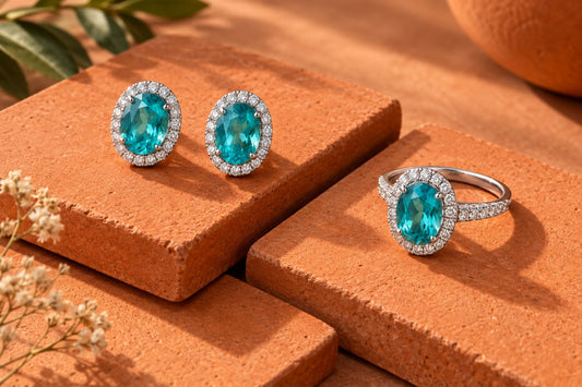
Balanced turquoise sits between blue and green, often producing the classic tropical-water impression. Medium-light tone helps the mixture remain readable.
The balance can shift across facets without being inconsistent.
What to check
Compare center and edge color and look for life rather than a flat digital glow.
Green-Leaning Teal
Green-forward stones feel richer and sometimes deeper. Warm surroundings can make green more apparent, while cool silver keeps the presentation clean.
This hue pairs naturally with cream, black, brown and complementary coral accents.
What to check
Ensure dark areas do not swallow the color in ordinary indoor light.
Tone Controls Luminance
A pale stone may look delicate and transparent; a medium stone may carry stronger presence; a dark stone may feel dramatic but less neon.
Size and cut alter how tone is perceived in finished jewelry.
What to check
Compare similar cuts and image exposure when judging tone.

Saturation Creates the Electric Impression
High saturation contributes to the vivid Paraiba look, but realistic gemstones still show facet boundaries, reflection and depth. An image that becomes a uniform glowing cyan shape is not informative.
Seek color strength with visible structure.
What to check
Use video or multiple angles and avoid drawing conclusions from one promotional image.
Lighting and Screen Effects
Daylight, warm bulbs, LEDs, camera white balance and screen night mode can all shift blue-green color. The same jewel may appear bluer outdoors and greener indoors.
Variation is expected; instability so extreme that the product no longer resembles its listing is different.
What to check
Compare on one calibrated screen and use the seller’s return terms as practical protection.

Sterling Silver as a Color Frame
Cool white metal reflects highlights without adding yellow to the visual field. This can make turquoise and teal appear crisp.
Setting depth, halo accents and background color still affect perception.
What to check
Judge the whole composition and select the blue-green direction that works with the wearer’s wardrobe.
Frequently Asked Questions
What is the difference between blue and green Paraiba color?
They describe different hue directions within a blue-green family. Neither is automatically better; exact material and personal preference matter.
Does neon mean the stone glows in the dark?
No. “Neon” is descriptive language for vivid color and brightness, not literal self-illumination.
Why does Paraiba-colored jewelry look greener indoors?
Warm light and surrounding colors can change adaptation and reflections, making green more prominent.
Does sterling silver change gemstone color?
It does not change body color, but its cool reflective frame can influence perceived contrast.
How can I compare online color responsibly?
Use neutral-light images, multiple angles, consistent screen settings, written material disclosure and clear return terms.
Map Blue-Green Color Without Inventing a Grade
Create three columns labeled blue-leaning, balanced turquoise and green-leaning. Place each product image into a column only after checking a neutral-light view. Then add separate notes for tone and saturation. This keeps a darker green stone from being described as simply “more green” when depth is doing much of the visual work.
Repeat the exercise with the images hidden and only the written descriptions visible. If the two results conflict sharply, ask for clarification or additional photographs. The map is a preference tool rather than a laboratory conclusion; it helps a buyer articulate what attracts them while respecting that camera processing, display settings and surrounding metal can all shift the apparent hue.
A useful photo sequence for blue-green jewelry
Ask for one still image in indirect daylight, one under an ordinary indoor light, and a short video in which the piece turns slowly. The goal isn't to find the most flattering frame. You want enough context to understand what changes when the stone moves. A still photograph captures one set of reflections; movement reveals whether that impression lasts or disappears as soon as the angle changes.
Keep the background simple. A saturated blue cloth can reflect into polished metal and influence the whole photograph. A neutral background makes comparison easier, although it doesn't turn a phone photo into a color measurement. Ask the seller to avoid filters and to include the entire piece in at least one view. An extreme close-up explains facets but says little about the effect of a small pendant worn with a shirt.
Don't request brighter exposure as a substitute for a clearer image. Increasing exposure can make a darker stone appear lighter while losing the boundaries between facets. Likewise, a vivid editing preset can strengthen a cyan impression that the jewelry doesn't have in person. If several photographs disagree, ask which image is closest to the seller's observation rather than averaging them mentally.
Read the setting as part of the color presentation
A blue-green center surrounded by clear accents doesn't create the same visual effect as that center on its own. The halo adds bright reference points. Your eye compares the colored area with those highlights, which can make the center seem more concentrated. A wide halo also changes the fraction of the piece occupied by color. Someone seeking a clear blue-green focal point should compare the center's dimensions with the dimensions of the complete setting.
The emerald-cut Paraiba-colored halo pendant is a useful example of this design question. Its current listing describes a 7 × 9 mm lab-grown Paraiba center and a plated sterling silver setting. That commercial wording does not, by itself, establish copper-bearing tourmaline. Ask for the exact mineral identity if that distinction matters to your purchase. The product handle contains the word sapphire, but a URL is not evidence of gemstone composition.
Pay attention to open space behind the stone as well. A photograph against a dark display can look different from the same pendant against skin or a light blouse. That difference alone doesn't prove a defect. What matters for a color-led purchase is whether the piece still gives you the blue-green impression you want in the setting where you'll wear it.
A practical comparison without a color-grading claim
Imagine two pendants with equally appealing photographs. One reads pale blue against white, while the other looks deeper green against black. You don't yet have a fair comparison. First request similar backgrounds and light. Next compare the actual stone dimensions and the amount of surrounding metal. Only then decide whether your preference is for a lighter tone, a bluer hue, or a stronger contrast with the setting.
Write those preferences in ordinary words: “light aqua that remains visible indoors” is more helpful than “the best neon grade.” Unless a recognized laboratory report supplies an applicable classification, invented grades only hide the decision. The same goes for terms such as AAAA or investment quality. Ask what an unfamiliar grade means, who assigned it, and which observable characteristics it describes.
For help turning a color preference into a purchase, the Paraiba-colored jewelry buying guide separates material disclosure from construction. If the question is where you want the color to sit, compare a necklace with a bracelet. Neither format is inherently more accurate in color; they simply put the jewel against different backgrounds and expose it to different movement.
Inspect color on arrival without changing the jewelry
Look at the piece near a window out of direct sun, then in the room where you normally dress. Leave protective tags in place and follow the applicable inspection and return conditions. Compare with the saved listing on the same screen, but recognize that a screen emits light while a gemstone reflects and transmits it. A perfect screen-to-stone match isn't a realistic standard.
If the appearance seems materially different, document the whole piece and its label in neutral light. Describe the difference precisely: greener rather than bluer, darker in ordinary room light, or less transparent through the center. Send that description with the order details to the seller. Don't polish, heat, soak, or chemically treat a stone to change its color. Appearance concerns belong in a product discussion, not a home treatment experiment.
Conclusion
Choose a blue-green palette by separating hue from darkness and saturation. Compare similar lighting, check the exact gemstone identity, and judge the finished setting at a believable size. A vivid photograph can begin a shortlist, but it cannot establish a mineral species or a laboratory color grade.
Explore Lumingem for current lab-grown gemstone jewelry and return to the exact item page for authoritative specifications, availability, shipping and care details.
Editorial responsibility: Lumingem Editorial Team. Product-specific questions: shopify@lumingem.com.
Tags:
Previous
How to Choose Paraiba-Colored Lab-Grown Gemstone Jewelry
Next
Paraiba Necklace vs Bracelet: Which Style Should You Choose?
Related articles
How to Pack Hip-Hop Jewelry for a Weekend Away
Sep 14 2026