
Padparadscha Sapphire Color Guide: Pink, Orange, Tone and Lighting
Padparadscha is not a single paint-chip color. Its appeal comes from the relationship between pink and orange, the lightness of the stone and the strength of its color under changing illumination.
See GIA’s sapphire reference for mineral and color terminology, and its care guidance for treatment-sensitive cleaning distinctions.
Hue: Reading Pink and Orange Together
Hue describes the basic color family. In this case, the key visual event is the coexistence of pink and orange rather than a stone that reads only as pink sapphire or only as orange sapphire.
Look at the whole face-up stone before chasing isolated flashes. Facets naturally create lighter and darker moments, so the dominant impression matters more than one photographic pixel.
What to check
Compare the center, edges and reflections; note whether both colors remain present when the stone is turned.
Tone: How Light or Dark the Stone Appears
Tone affects whether the blend feels airy peach, saturated coral or deep sunset. Very pale material may lose presence at a distance, while very dark material can hide the pink-orange interplay.
There is no universal ideal for every design. Smaller earrings may benefit from a more visible tone, while a larger ring can carry subtle color because its face-up area is greater.
What to check
View the piece against skin-like neutrals, white and a dark background to understand how surroundings alter perceived depth.

Saturation: Strength Without Artificiality
Saturation is the intensity of color. A vivid stone can look energetic, yet saturation should not erase nuance or make the surface appear digitally neon. Softer saturation can feel refined when the cut remains lively.
Online shoppers should separate gemstone color from editing style. Strong contrast, boosted vibrance and clipped highlights can make a photograph impressive but less useful.
What to check
Seek multiple images with consistent color and avoid relying on a single heavily styled campaign shot.
Daylight, Indoor Light and Color Temperature
North-facing daylight, direct sun, warm household bulbs and cool LEDs each change the way pink and orange are perceived. The direction and strength of the change depend on the light source, the gemstone, and the camera or eye observing it.
A change in perceived color between rooms can be part of the viewing experience; it does not by itself establish a gemological color-change classification. The useful question is whether the jewel remains attractive across the environments where it will be worn.
What to check
Evaluate neutral daylight first, then ordinary indoor light. Keep screen brightness and night-mode filters consistent while comparing.
Cut Can Redistribute Color
Facets do not create body color, but they control how light travels and where brightness, extinction or windowing appears. A well-proportioned cut helps the blended hue feel coherent.
Brilliant-style ovals and hearts may produce lively small flashes. Step-like or broader facets can create calmer planes. Neither is automatically better; the design should support the intended mood.
What to check
Watch for a transparent dead center, heavy dark patches or asymmetry that distracts from color.

Metal Changes the Visual Frame
Sterling silver creates a cool, bright boundary that can clarify warm pink-orange color. Warm metals may blend with orange and produce a softer overall effect. Accent stones add another contrast variable.
The same center can appear different when photographed in a silver halo versus by itself. Compare like with like when judging two products.
What to check
Consider the wearer’s skin undertone and existing jewelry, but do not treat styling conventions as fixed rules.
How to Compare Product Photography
Begin with images that show a neutral background, accurate exposure and more than one angle. Lifestyle images are helpful for scale, while close macros can help show visible zoning and facet behavior, although photographs cannot replace gemological examination.
Screens vary, and compression can change subtle peach tones. A responsible decision combines images with the written gemstone description and a workable return policy.
What to check
Save screenshots only for comparison; rely on the live Lumingem listing for current specifications and availability.

Build Your Own Color Preference
Create a short vocabulary before shopping: blush-peach, balanced pink-orange, coral, or orange-leaning sunset. Clear language helps you compare without pretending color is perfectly objective.
Select two or three examples and rank them in the same lighting. This reveals whether you prefer softness, contrast or saturation more reliably than abstract grading terms.
What to check
The right Padparadscha color is the one that remains compelling after the first dramatic photograph and works with the wearer’s real wardrobe.
Frequently Asked Questions
Why does Padparadscha look different in photos?
Lighting temperature, exposure, editing, background and screen calibration all affect subtle pink-orange colors. Compare neutral-light and indoor-light images.
Can Padparadscha be more pink than orange?
Visual balance varies. A stone may lean slightly one way while still presenting a blended impression; seller terminology and any laboratory documentation should be read carefully.
Does cut change Padparadscha color?
Cut changes brightness and the distribution of light, which can alter perceived color even though it does not change the stone’s underlying body color.
What metal shows Padparadscha best?
Sterling silver offers cool contrast, while warm metals can emphasize peach. The best frame depends on the exact stone and the wearer’s style.
How should I compare color online?
Use several images, consistent screen settings, neutral daylight references, written specifications and a clear return policy.
Create a Useful Padparadscha Lighting Record
Photograph the same reference object at midday near a window, under a warm lamp and beneath a neutral LED. Lock exposure if your phone allows it and place a white sheet of paper beside the object. This is not gem grading, but it demonstrates how strongly the room and camera influence subtle warm color.
When a Padparadscha piece arrives, repeat those three conditions without editing. Note whether pink, orange or brightness changes most. A stone that becomes peach indoors and pinker outdoors can still be coherent; what matters is that the transitions look plausible and the piece remains attractive. Keep the record with the order details so future styling decisions use your real jewel rather than a remembered product image.
A Color Name Is Not a Laboratory Conclusion
Padparadscha is a color designation associated with a pink-orange sapphire appearance, not a separate mineral species. A retail listing can use the word as part of its product description. That doesn't mean an independent laboratory has classified that particular stone under its own criteria.
Read any supplied document for the exact wording. Does it identify sapphire? Does it disclose laboratory origin? Does it actually use the Padparadscha designation, or is that only in the sales description? These are separate questions. A document's issuer and scope matter more than the presence of an official-looking border.
A photograph can't answer the origin or treatment question. It also can't conclusively establish whether a stone meets a particular laboratory's color criteria. Our gemstone report guide explains how to check what a document does and doesn't say.
Avoid Three Common Online Comparison Traps
Comparing a loose stone with a mounted one
The setting changes the visual surroundings. A broad bright halo, warm-colored metal, and an open or enclosed gallery can all influence the impression. If one candidate is photographed loose and the other is mounted, don't attribute every difference to the stone itself.
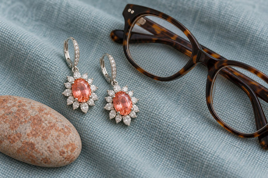
Use the snowflake Padparadscha ring as an example of a center surrounded by a strong decorative frame. Its listed moissanite accents create a different visual context from a plain solitaire. Judge the overall design as well as the center color.
Assuming the first picture is the exact item
Ask whether photographs show the individual item, a representative sample, or an editorial illustration. A sample image is useful for design, but it can't promise that every stone will have identical tone. The oval Padparadscha statement ring description expressly notes that its center-stone shade can vary slightly.
Keep that disclosed variation in mind when choosing. If an exact shade is essential to match another item, request the available information about the specific piece before ordering. Don't treat a screen color picker as a guarantee of the delivered gemstone.
Judging only at maximum magnification
Zooming in can make a small patch of color seem more important than it is at wearing distance. Start with the whole piece at approximately its actual size, then use close-ups to investigate anything that concerns you. The two views answer different questions.
Step back from the screen occasionally. Ask whether you see a warm blended impression, a predominantly pink stone, or a predominantly orange one. Write down that observation in plain language instead of trying to convert it into a grade you aren't equipped to assign.
Turn Observations Into a Useful Seller Question
Instead of asking whether a stone has the best color, describe the difference you see: the daylight photo looks pinker than the indoor photo, or the center appears darker than the edges. Ask whether additional neutral-light images are available and whether the pictured color is representative.
Keep color preference separate from construction. You might love a shade but need a smaller setting. Our Padparadscha buying guide connects those two decisions without treating a color name as a complete product specification.
Conclusion
Read Padparadscha color as a relationship among the stone, its setting, and the light around it. Use accurate product language, compare photographs under useful lighting, verify dimensions and select the design that fits the wearer rather than an abstract ideal.
Explore Lumingem for current lab-grown gemstone jewelry and return to the exact item page for authoritative specifications, availability, shipping and care details.
Editorial responsibility: Lumingem Editorial Team. Product-specific questions: shopify@lumingem.com.
Tags:
Previous
Paraiba-Colored Jewelry Gift Guide for Birthdays, Anniversaries and Travel Lovers
Next
Lab-Grown Padparadscha Sapphire Ring Guide: Shape, Setting and Wearability
Related articles
How to Pack Hip-Hop Jewelry for a Weekend Away
Sep 14 2026