
Padparadscha and Blue Sapphire Jewelry: Two Ways to Add Color
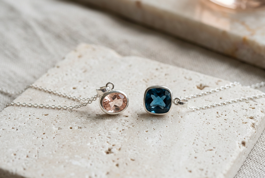
You do not have to replace your wardrobe to enjoy colored jewelry. Sometimes a single pendant changes the mood of a plain shirt more effectively than another patterned layer. Two useful directions to explore are the soft pink-orange impression associated with Padparadscha designs and the stronger contrast of deep blue sapphire jewelry.
This is a styling comparison, not a test of gemstone identity. A photograph can suggest a palette, but the individual product description must explain the stone, origin, metal and any disclosed treatments. Start with the color you enjoy, then verify what the piece actually is.

Choose a color mood before a matching set
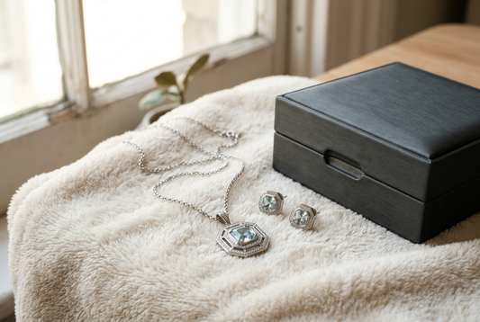
A peach-pink pendant can introduce a gentle warm accent beside cream, charcoal or a plain neutral top. A deeper blue pendant can provide a clearer focal point against white or pale gray. These are starting combinations, not rules about which colors you are allowed to wear together.
Think about the piece you would reach for on an ordinary morning. If you already wear mostly dark shirts, compare both colors against one of them. If your wardrobe is light and simple, notice whether you prefer a softer transition or a more noticeable contrast. The useful choice is the one that feels natural with clothes you already own.
Try peach-pink with a quieter silhouette
When the color is subtle, a simple outline can help you notice it without making the whole outfit feel busy. Try one pendant with a plain neckline, or small earrings with an open collar. Give the color some visual space before adding another detailed accessory.
Do not assume that every peach or pink stone should be described as Padparadscha. Names in product titles should be supported by the specifications. If a listing uses several color terms interchangeably, ask what each term is intended to describe rather than judging the identity from the photograph.

Use blue as a central focal point
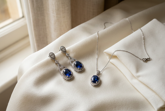
A blue gemstone can stand out on a simple chain without needing a large surrounding design. Check the pendant dimensions as well as the stone measurements. A substantial border may make the finished piece look much bigger than the center stone suggests.
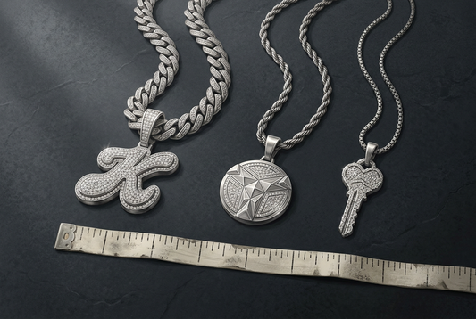
If you are exploring sapphire hip hop chains, separate the chain design from the gemstone description. Check whether the chain is included, how wide it is and whether the pendant bail fits it. A blue center stone does not tell you the material of the chain or the identity of any surrounding accent stones.
Decide how much sparkle supports the color
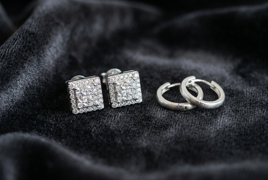
Iced out jewelry can add a bright frame around a colored focal point, but more sparkle is not automatically more effective. A detailed pendant may work best with a plain chain and a quiet neckline. If the chain itself has a strong visual presence, compare a smaller pendant or wear the chain alone.
Consider the whole silhouette from a normal viewing distance. Close-up product photography emphasizes stone detail, while an outfit view shows how the jewelry relates to the neckline, shoulders and other accessories. Both views answer useful but different questions.

Let metal tone support the outfit
Try the pendant beside the metal tones you already wear, including a watch or favorite earrings. You do not need every piece to match exactly, but repeating one tone can make an outfit feel deliberate. Alternatively, keep the rest of the jewelry minimal while you experiment with the new color.
Read finish descriptions carefully. Gold-colored and silver-colored refer to appearance unless the listing gives more specific material information. Color coordination and material identity are separate decisions; one should not be used to guess the other.
Compare in everyday conditions
Look at the jewelry with the intended outfit in daylight and ordinary indoor lighting when possible. If you are shopping online, ask for additional images when you cannot judge scale or color context. Do not expect a studio image to predict every lighting condition.
As you explore colored jewelry at Lumingem, use each item's specifications to check the details and your own wardrobe to judge the styling. Choose peach-pink when you want a softer warm accent, deeper blue when you want a stronger point of contrast, or enjoy both on different days. The aim is a color you want to wear, not a set of accessories selected only because their labels match.
Tags:
Previous
Lab Grown Emerald, Lab Created Emerald and Synthetic Emerald: Reading the Labels
Next
Sapphire Bridal Jewelry: Earrings or a Necklace for Your Dress?